How do we match colors?

Colour is the first thing other people notice about us, and its impact is immediate and long-lasting. Our fashion colour choices say a lot about the image we are trying to portray and how we feel about ourselves. So what does colour tell people & how do we match them to display a perfect picture?
Within seconds of meeting you, others will respond to the 'colour messages' flashed by your clothes. Different colours can make people feel a certain way. In fact, it has been determined by medical science that colour can influence the viewer's hormones, blood pressure and body temperature. Colour also has an impact on:
* Your apparent shape;
* Your apparent weight;
* Your apparent personality;
* Your emotions
* Others emotions
Other important considerations are how appropriate the colour is for the location, occasion, time of year, your age and of course, your natural colouring.
We are all influenced by colour every day, whether we realise it or not. If we're having a bad day and not feeling good about ourselves, we tend to automatically choose clothes in dull neutral colours like black, grey or brown because they match how we're feeling. Just as when we're happy and feeling great we will go for something a bit brighter.
Have a look in your wardrobe and see how many different colours you own. Do you have a veritable rainbow of outfits? Or are there just 1 or 2 colours that you wear a variation of all the time? You may find you are stuck in a colour rut. Knowing this, why not experiment with the colours you wear and surround yourself with.
Sometimes it is not just the colour itself, but a combination of colours that create the affect. Colours produce different reactions when used in different fabrics and when put together in different colour combinations. For example, a red jacket worn with a white shirt to a business meeting exhibits confidence and power, but a red jacket worn with a lacy red top may be interpreted as saying, "I'm sexy and exciting and I have other things on my mind besides this business meeting".
Red is actually not the best colour to wear to a job interview as it can set the scene for an uneasy interaction between females. So what colours are appropriate for what situation?
Here is a list of the colours that men respond well to, both socially and professionally.
* Yellow: Holds their attention and keeps them alert; indicates the start of something new
* Yellow-based reds: Energetic colour that keeps conversations going
* True reds: Exhibits confidence
* Burgundy: Reflects class and sophistication and attracts the same type of men
* Mid-range blues: Puts others at ease and allows interactions to go smoothly
* Sky blue: A calming colour
* Navy blue: Signals that you want to be taken seriously; it inspires others to listen to what you have to say and displays that you are trustworthy
* Blue-based reds: Suggests intelligence and femininity
* Red violet: Suggests strength and creativity 
It is most important though, to choose colours that are a good fit for your natural colouring. There is no point choosing a colour that suggests creativity and confidence if it also makes you look washed out or sick.
Wearing your best range of colours can have a huge impact on your wardrobe and your confidence. The right colours can make your skin tone appear more even, reduce the appearance of wrinkles and dark circles and make you look brighter and healthier. While on the other hand wearing a colour which isn't so good for you, can make you look tired, dull and even ill. A colour analysis with a professional image consultant will show you exactly which range of colours are best for your clothing, makeup and accessories.
In short, our fashion colour choices tell the world a lot about us. Knowing how to use colour to your advantage can change the way you dress and boost your self-confidence.
An easy way to mix your colours is to mix 2 neutrals with 1 colour, this is a fail safe way to mix colours.
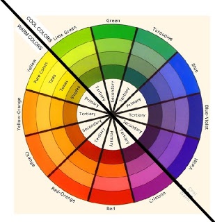
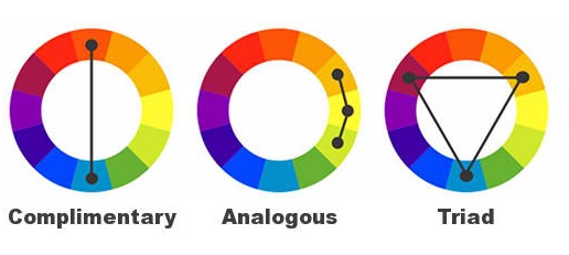
You can get an idea from a colour wheel and use that as a guide on how to combine colours successfully

1. Complementary – colours that are opposite to each other on the colour wheel
2. Triadic – 2-3 colours spaced equally on the colour wheel
3. Monochromatic – different shades of the same colour
4. Analogous – 2-3 colours next to each other on the colour wheel
Always remember to have a dominant colour, a secondary colour and then add an accent colour in a smaller amount.


